The problem
The Carbon mobile app had quite a number of key issues. The user interface of the entire application didn’t look modern nor intuitive, it lacked some necessary features, it had a lot of user journey issues in onboarding and no proper guide for users within the app for issues like KYC specific requirements(customer service is always bugged with tickets). As a result, the users had a painful experience navigating the app.
Goal
The business wants to increase the onboarding rate, disburse more loans and re-evaluate the entire app to have a new interface and better experience. Also improve the onboarding process for new design hires, this means an industry standard design system and proper documentations of the design as there were some existing screens live on the app that didn’t exist on the Figma board.

🌞
Morning, Florence
9:41
YOUR LOAN
Need cash urgently?
You might be eligible for a loan from
N1,000 to N45,000.
Apply for a loan
Send money
YOUR Account
ACTIVE
ACCOUNT BALANCE
Account number: 1009005438
₦ ****
Quick access
Buy airtime
Carbon Zero
Pay a bill
Loans
Not Henry?
Sign out
Welcome back,
Florence!
Enter your PIN to continue to your Carbon account.
0
WXYZ
9
TUV
8
PQRS
7
MNO
6
JKL
5
GHI
4
DEF
3
ABC
2
1
-
-
-
-
Face ID

Welcome to the future. Carbon is your passport to world-class financial services, built just for you.
Go beyond banking
Setup new account
Have an account? Sign in
The Approach
The Carbon team is pretty Agile. For my role, my focus is on the product design improvements, new feature requests, new user interface and a better user experience on the native iOS and Android mobile applications for On-boarding, Payment, Savings, Cards, Carbon Zero, Bill payment, Airtime and TV subscription purchase. I also contribute to the design system which a team of 3 designers work with.
For a typical Feature request, here’s how the design process flows
Problem
Discovery
Tickets
are assigned
on Jira
Brainstorming
with the
Product Manager
Screen
Designed &
prototyped
DesignTesting with users on lookback
Presentation
to Devs
for handoff
Problem
Discovery
Yes
No
This can come from
any internal stakeholder
on slack. We have dedicated channels for each pod.
I also conduct user research and design testing if necessary at this stage based on the problem.
Tickets are assigned based on level of priority. I create tickets assigned to me on Jira, I also get to link the Figma links to the Hi-fis when done.
Some User research for Onboarding
Based on the problem being fixed. The research and test being carried out varies. I once interviewed existing users of one of the products called Carbon Zero which was a new product. I interviewed users and stakeholders. I went deeper about this in my other case study called Carbon Zero. I carried out some design testing on Carbon mobile app which involved recruiting 3 users to test the new design prototypes.
User A was a high end iPhone user who is highly tech savvy
User B was a mid range iPhone user who is not so tech savvy
User C was a low end Android user who is not tech savvy
I hosted several sessions with them on Google meet & documented all these experiences on Confluence to share with the team. We then schedule meet sessions with PMs, Engineers to discuss about all the issues raised and create tickets from there.
Research Screenshots


For the purpose of this case study, I will be highlighting some of the core pain points of the Carbon Application users for our on-boarding process. A lot of these issues have however been fixed. We wanted a lot of the users to upgrade from one KYC level to the other and they had to perform some tasks including email verification, live selfie upload etc.
Long registration Process
“The registration process is too long, some screens can be merged e.g the email verification page. 6 pages for signup is too much”
“After entering my email and waiting for the confirmation email to drop. I get the welcome to carbon screen, after clicking next it brings me back to enter your email page”
3. Unable to take Selfie on low- end android
“I tried taking a selfie for KYC update but I got a message that says ‘picture quality not good enough, please retake a photo of you in a brighter area’. My phone camera still works, I live upstairs and I can’t go out for sun just to take a selfie. I have tried like 10 times already. It’s an old phone though”
2. Awful selfie upload process
“Sefie page, the capture button disappears sometimes”
“All of a sudden the selfie is now accepted. If it’s processing, a loader can be shown pending when the result is received”
“After waiting for 5mins, had to restart the app, then selfie isn’t saved anymore *covers face sighing”
“Trying to capture selfie now, crashed the app, app just keeps crashing”
“Now I tried to login back and seeing one of the many pictures taken as my profile pic, how?”
3. App freezing
“On first attempt, the verification email did not work. The app froze, I had to restart the app to finish up the email verification aspect”
User Persona

Name: Michael Jane
Family: Single lady
Location: Lagos, Nigeria(visiting family)
Education: University of Calgary
Occupation: Family Physician
Bio
Jane is a 27-year-old lady that came into the country briefly. She needs a quick account to hold some local funds for transactions. Documentation might be an issue for her.
Goals
A seamless on-boarding experience with easy documentation requirements like my Passport.
Opening a bank account without having to walk in physically.
Easy access to loans when I need it. I do not carry a lot of Naira.
Frustrations
Too many documentations requested by local banks to open a functional bank account.
No time to actually walk into a bank physically to open an account or perform a transaction.
No reliable source to easily take a quick loan when I can’t convert my FX.
User Journey
Action
Splash screens
Onboarding
KYC
Perform transactions
Task lists
Browse through splash screens to actually understand what Carbon is about and what value they can derive.
Provide phone number for verification
Provide other fields like name, email etc
Provide all documentations such as government issued ID, live selfie
Perform transactions like send money, request a loan etc
Task lists
“Don’t bore me out”

Can this be any faster?

You mean I have to go through all these?

Finally, I’m home?

Task lists
I need to understand what Carbon is at a glance without so much distractions.
I want a smooth on-boarding process without having to enter so many details.
Can the verification process be fast at least?
I want to be able to easily send money and request for loan.
Task lists
On-boarding screens should be benefits focused
Forms should be clean with labels to foster accessibility for a wide range of users
Documents required should be well detailed, formats accepted should also.
Information architecture should be well laid out and users should easily see actions they perform regularly, each user’s dashboard experience can be customised.
Splash Screen Improvements
BEFORE
Welcome to the future. Carbon is your passport to world-class financial services, built just for you.
Go beyond banking
Setup new account
Have an account? Sign in
Carbon makes financial services faster, cheaper and more convenient. You can access the app 24/7, wherever you are.
Stay on top of your finances. Anytime. Anywhere
Setup new account
Have an account? Sign in
With Carbon’s market-leading service already used by millions of people just like you, you’re in very good company.
Trusted by millions
Setup new account
Have an account? Sign in
AFTER


Key insights
Old screens were not really benefit focused and some UX copies were a bit vague. New copies are more specific and explicit about the value user will be getting by signing up.
Old screens are also somewhat carrying ‘stale designs’ . They cannot be compared with designs from carbon’s close competitors like Kuda.
Old screens do not have any form of animation to keep users engaged, new designs are well animated to keep users engaged.
Users now have a progress bar to give them a feel of how long the process will take.
BEFORE
Florence Dairo
Client ID : 60048494855
Joined : May 23,2017
LEVEL 3
Personal details
Cards
Spread the love
Preferences
Security
Frequently asked questions
Rate us
About Carbon
Sign out
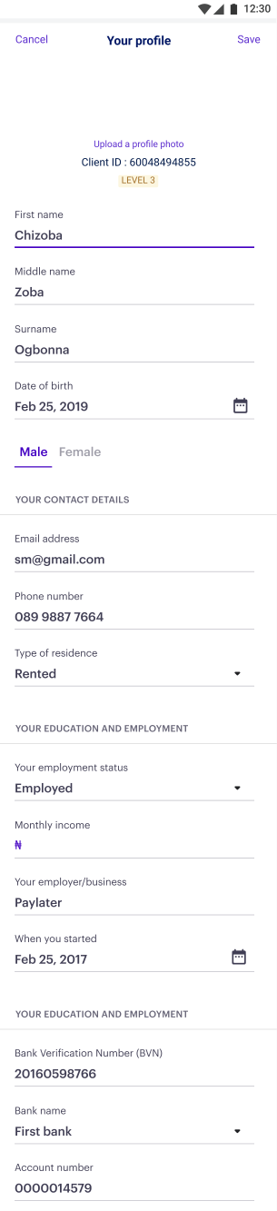

Update employment details
Update your most recent employment details.
Save
12:30
AFTER
Profile
Request statement
Support
Cards and banks
Security settings
Preferences
Account limits
Refer a friend
Rate us
About Carbon
Sign out
Florence Dairo
Client ID: 1009005438
Joined: May 23, 2022
LEVEL 3
Version 8.1.9
Home
Savings
Payments
Loans
Account
We don’t share your personal details with anyone. This information is required solely for verification.
Personal details
Bank details
Residential details
Employment details
Next of kin
Change profile picture
Profile
9:41


Save
Bank details
9:41
Some fields are locked for editing. Please Contact us here for assitance
89478364872684
Bank Verification Number
Why BVN?
I don’t know my BVN
Save

CBN Licensed

Insured
Key insights
Existing screens do not conform with updated existing design system icons. Categorisation was also improved.
Improvements were made on android users experience as existing design required to scroll all the way down to fill certain KYC details.
Copies were also improved e.g users now get a brief side note on why we need their employment details.
A note was also added to build trust on the profile page educating users on why we require their personal details.
A lot of the design contributions are released in bits. Everything published in this case study has gone live as at this time. The Carbon app is available on iOS and Android Play Store for download.
Over 30% increase in sign up rate
Android Play Store rating went from 3.9 to 4.3
More organised design system practises and easier collaboration with the engineers
MOJOLAADE ADEGBITE
Carbon Mobile App Case Study
This digital micro-finance banking app makes financial services faster, cheaper, and more convenient. Users can access the app 24/7 from anywhere in the world.